
We have some exciting news to share: LHB has a new brand and updated website!
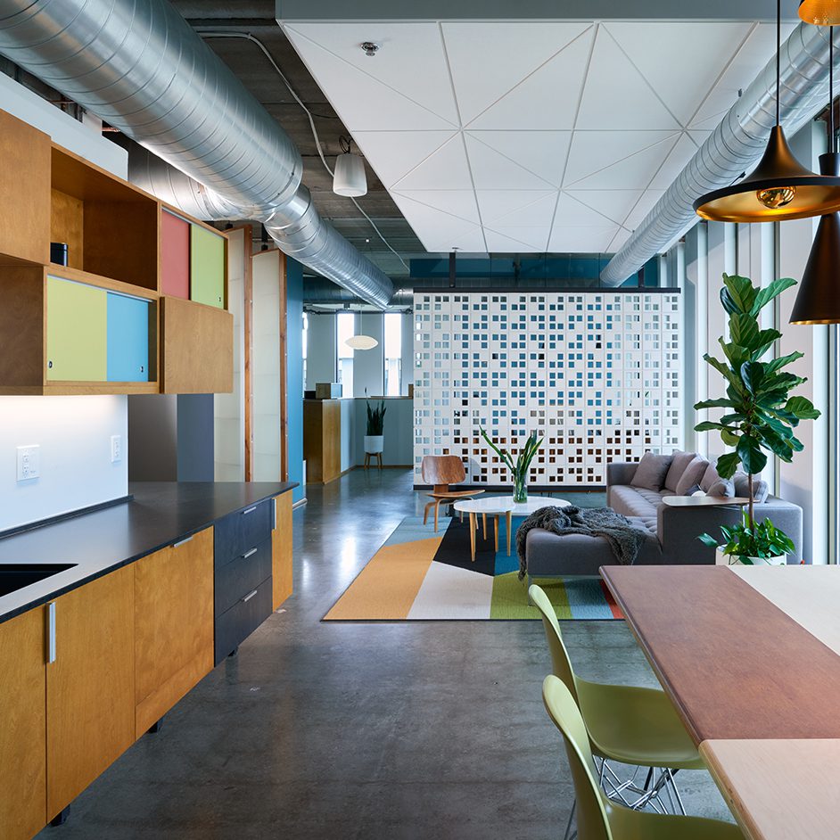
Starting today, you’ll notice a fresh look and feel in your communications and interactions with LHB. You’ll spot our new logo and colors on proposals and presentations, caps and contracts, trucks, and trade-show banners. If you visit our offices in Duluth or Minneapolis (we hope to welcome guests again soon!), you’ll be greeted by rebranded signage and other elements.
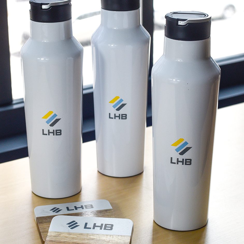
We’re particularly excited about our vibrant new logo. (Our brandmark was last updated in the 1990s, and the logo only appeared in black and white.) Our new visual identity is more than just a cosmetic makeover, however. The typefaces, colors, and logo are visual markers of a larger transformation that has occurred over the past decade at LHB.
The logo, for example, is composed of three separate bands woven together to create a larger, bolder image—not unlike how our business units and studios have begun to work together more closely, creating a stronger and more unified LHB. The colors—aqua blue, sunshine yellow, and gunmetal gray—are intended to make you think of things that relate to our business, like water, energy, and even asphalt. The blocky but modern typeface—with sharp corners—might remind you of some sturdy structures or eye-catching spaces we’ve designed in recent years.
“Why change things up? Over the last few years, LHB’s focus on performance-driven design and close-knit client relationships has helped grow our business considerably.”
Similarly, our website has been updated to better reflect the many ways LHB has grown in recent years: We’re more diverse, more values-driven, more holistic. Our website has been restructured from top to bottom, inside and out, with an emphasis on:
- Expanded markets & services. Our capabilities encompass 12 key services, and we now serve 15 distinct markets.
- Culture & values. From project design and client service to community support and volunteer work, our actions are driven by our people-centered approach, as showcased on the site.
- Job postings & digital recruitment. We know our success is fueled by the work of talented people. (If you like what you see on our site, consider joining us!)
- Design experiments & innovations. Our new Insights blog will allow us to share big ideas, engaging conversations, and intriguing research that affects our clients and the markets we serve.
- Improved accessibility. The site is designed to Web Content Accessibility Guidelines, so all LHBcorp.com visitors can enjoy and interact with the content.
Why change things up? Over the last few years, LHB’s focus on performance-driven design and close-knit client relationships has helped grow our business considerably. We have added valuable skills and specialties to the capabilities we offer clients, and our culture has become more open and transparent. Our brand needed a refresh to truly reflect who we are today.
Not sure what you think about sunshine yellow or Titillium? (That’s a font used on our site, not a flower or rare metal.) No worries. Adjusting to change takes time. But please know that the fundamentals of how we do business at LHB remain very much the same, of course: We approach each fresh challenge with curiosity and passion. And we are dedicated to bringing our best selves to every situation. We understand that the strength of a brand ultimately depends on what people believe about it, and we know that LHB’s reputation for professionalism and excellence stems from the clients and communities who have trusted us, tested us, and pushed us to deliver outstanding results.